Google Analytics New Cohort Analysis: Everything You Need to Know
Google Analytics is known as one of the top programs available for companies looking to incorporate data analysis into their business plan. It has a lot of great features to help simplify big data into accessible reports that business owners can use to learn from their successes and failures, but up until recently it had one big drawback—it lacked the ability to for cohort analysis. This is not a problem any longer, however, as Google recently announced that this will be a new feature of the program. We believe this is a welcome addition for most entrepreneurs, so we’ve put together a list of things you need to know if you’re thinking about doing a cohort analysis.
What is a Cohort?
The Google definition of a cohort is “a group of people with a shared characteristic.” In entrepreneurial terms, this group of people specifically means a group of consumers or a target audience. In other words, a cohort analysis is essentially the study of a group of people who have interacted with your business in some way, whether it be by visiting your website, signing up for email marketing, making a conversion, etc. You study groups of people, or cohorts, over a set period of time to see how their behavior changes. You can determine which characteristic(s) you want to analyze, and Google Analytics will help you figure out how to use that group to maximize the potential of your business (aka to spend more money). This may seem like a daunting task especially for those who aren’t inclined to numbers and data, but thanks to the new cohort analysis feature in Google Analytics, it’s actually pretty simple to do. Here’s what you need to know to get started:
When Creating an Analysis Report, You Have 4 Options
1. Cohort Type
Cohort segments are based around a date, so when choosing the type it’s basically asking you to choose the date where you want to begin the analysis. Right now your only option is customer acquisition date, aka the date that your customer first used your website or app.
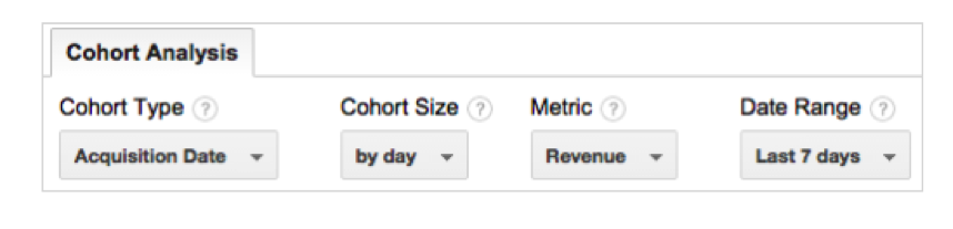
2. Cohort Size
You may think that cohort size relates to the size of the group of people you want to analyze, but you would be wrong. Remember that the cohort type refers to a date, so when you have to choose an option for type it’s also referring to a time period. The cohort size is the window of time you want to use in the analysis. This is different from the type because the type refers to the specific date where you want to begin (one day), whereas the size refers to multiple dates. For example, if you want to study the number of users who visited your website in a week’s time period, the beginning and end dates of that week would be your size. Your current options are a day, a week, or a month.
3. Metrics
Metrics refer to the actual data that will be produced in the report. According to Lunametrics.com, your options for metrics are:
- Goal Completions per User
- Pageviews per User
- Revenue per User
- Session Duration per User
- Sessions per User
- Transactions per User
- Total Goal Completions
- Total Pageviews
- Total Revenue
- Total Session Duration
- Total Sessions
- Total Transactions
- Total Users
4. Date Range
This may seem redundant since you’ve already chosen a date range in the cohort size section, but this is Google’s way of double checking what you want and making sure you’ve got the dates correct. To use the earlier example, if you want to analyze how many people visited your website in a week, and you chose Monday, Feb 20th as your acquisition date (aka cohort type), then you would assign the date range as “the last 7 days” and Google would use Feb 20th- Feb 27th as your date range. It would collect data from this time period based on each individual user’s acquisition date. If you choose a week you can choose just the past week, or 2 or 3 weeks before that, and the same with a month- you have the option to look at the past month, or the past 2 or 3 months.
Once you’ve configured a report, there are 3 main sections to review: report settings, data over time, and tabular data.
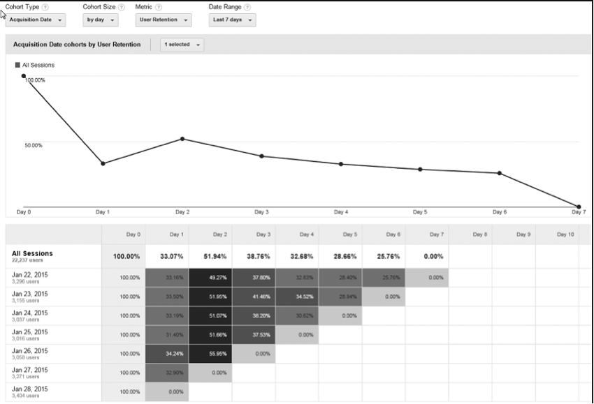
There are 2 Different Ways to View This Data
1. Line Chart
This data visualization is exactly what it sounds like—a line chart where you can plot the points of all the different cohorts you’ve analyzed in order to see how they trend over time. It’s simple to put together and simple to read, so if you’re planning on presenting this data to anyone else who might not be analytically-savvy, a line chart is the way to go.
2. Triangle Chart
Unlike the line chart that looks exactly like it’s name, a triangle chart is not actually in the shape of a triangle. It’s also known as an “impact plot”, and it’s slightly more detailed than a line chart. The triangle chart lists not only the cohorts you’ve analyzed, but their metrics as well, and it uses different shades of color to depict intensity. While it is more difficult to read, it also provides a detailed picture of the behavior of each of your cohorts and may be welcomed by stakeholders who understand data analysis and want an in depth picture of customer behavior.
So What Do We Think?
The cohort analysis feature is still a beta, meaning it’s still being tested and worked on by its creators, so it’s important to take this into account when incorporating it into your business. It definitely still has some issues that need to be ironed out, and overall it’s not terribly accessible for anyone who’s not already an expert at Google Analytics. That being said, we definitely think it’s going to improve over time and develop into a “must-have” feature for entrepreneurs, so by playing around and experimenting with it now you could be putting yourself ahead of the competition who’s decided to write it off until it’s perfect. This way, you’ll be ready and already know how it works and how to implement it by the time everyone else decides to give it a shot. In the meantime, try the new Google Analytics demo account.
Have you implemented cohort analysis into your business plan or had time to experiment with Google Analytics’ version? We’d love to hear about your experience! Comment in the section below.
Image credit 1: yoast.com
Image credit 2: support.google.com
About The Author

Jason Hawkins / http://www.themiamiseocompany.com
Jason Hawkins is the CEO & Co-Founder of The Miami SEO Company. He has over ten years of experience in search engine optimization, conversion rate optimization and lead generation. His core responsibilities include identifying ways to increase value of services rendered, training staff on advanced SEO topics, and A/B testing internal processes to consistently improve client return on investment.