6 Common Mobile SEO Traps to Avoid
Your company is growing and so are smartphones’ capabilities. Users typically conduct their initial inquiries on smartphones, and to be successful in 2017, mobile optimization is imperative. Below is a list of suggested practices regarding what to include and exclude when designing the landing pages of your mobile websites.
Misrepresenting Yourself
Including more keywords than necessary can be tempting when trying to climb the daunting list of the hundred other websites representing what you are offering, especially where mobile apps are concerned. However, misrepresenting yourself by including these unnecessary keywords can really be falling on your own sword. Some companies mistakenly think that because Google primarily indexes search results based on desktop page versions, they need to overcompensate with misleading content. If potential users don’t see relevant, accurate content within in the first ten seconds of opening your browser, they are sure to move onto another option. To avoid this, be consistent with your wording, clear in your purpose, and accurate in your content.
Neglecting Social Media
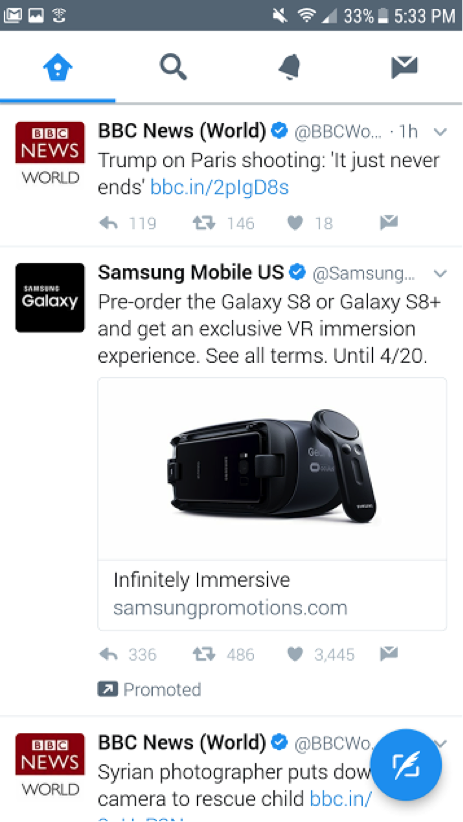
Social media is the beast that can’t be killed; it is also the gateway into the mindset of the biggest boom of entrepreneurs we have seen: millennials. Because so many people make use of social media, and because its presence will only increase in the years to come, working within these platforms is imperative. Facebook Live, Twitter’s Newsfeed, and SnapChat’s ever-changing filters offer alternative means to connecting with the public and should not be overlooked. Users’ search results are almost guaranteed to be tracked to a certain degree, meaning potential clients could be led right to you if you have a strong presence on social media. Post images on Instagram, daily. Let the public visualize what your company can offer. Send out tweets, daily. Let the public be reminded of the services you can offer while they scroll through their feed. This is, believe it or not, even more important for mobile.
Ignoring Mobility
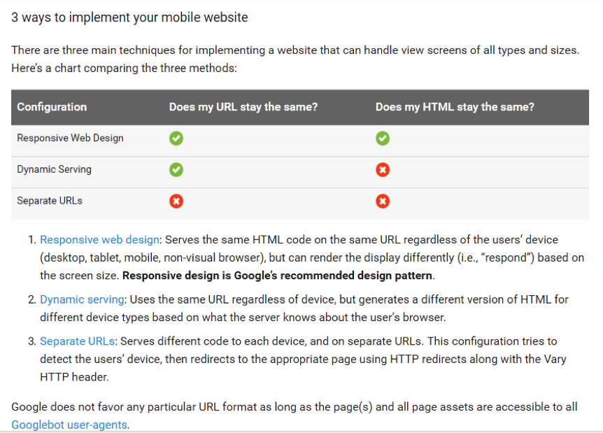
Many users are browsing during their 20-minute commute home or during their child’s mundane little league game when their long to-do list is still on their mind. This is typically done discretely on a phone and because of that, mobility is something that must be considered. Too often sites ignore the fact that people need concise details and large key options when looking at a screen the size of their hand. Users are left zooming in to read keys, scrolling back and forth to follow content, and mis-clicking buttons that are placed too close together. To avoid this, consider which elements need to be adjusted in order for your desktop site to be successful as a mobile site.
Overlooking Organization
You never want users to feel overwhelmed or discouraged when visiting your site. Pages should be aesthetically pleasing, but practical. Manage Inbound identifies the top six components of a visually appealing site as color, font, imagery, simplicity, usability, and consistency. Think of how you navigate a new site- what draws your eye? What do you ignore? What do you expect to see when you open the page? What distracts you? The easier it is for users to guide themselves through your page, the more successful you will be, so take time to live in their shoes and reflect on how to create a beneficial experience.
Abundant Ads
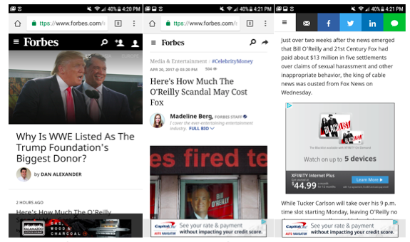
Ads can be tempting in that they provide an extra layer of stability for your growing business, but when those images or links become annoying to users and distract them from further investigating what you have to offer, it’s time to manage those suckers. You can see from the succession of images below, my recent trip to Forbes’s mobile website. Not only am I subjected to a permanent footer as I browse, but also various advertisements within the articles themselves.
Advertisements can frustrate and discourage users from continuing on your site, especially when they can’t find that minuscule “x” to close out or accidentally tap on the ad itself, redirecting them to another site.
If you insist on offering ads on your website, we highly recommend native ads. Native ads look and feel like your site. For example, if you write a specific type of article each week, you could have a sponsor write another article that is just as witty and engaging as the posts you write. The only difference is that is was written by a sponsor. You can learn more about native ads here.
Lagging Load Time
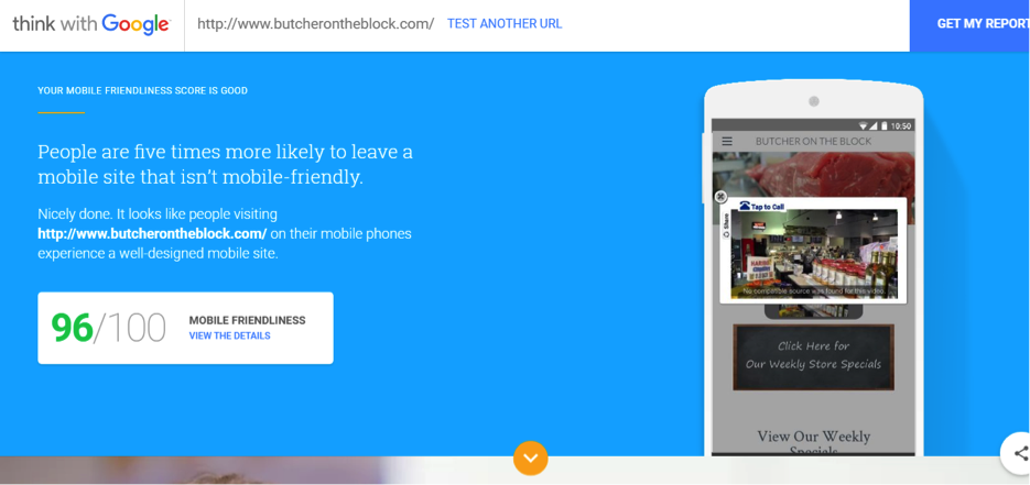
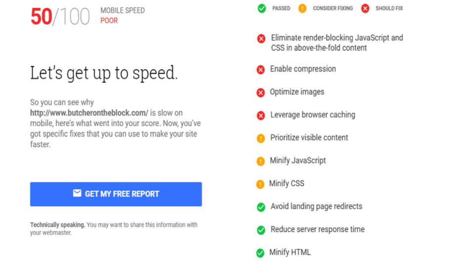
While some mobile sites hit the mark in terms of organization and aesthetics, sometimes they fall short on the speed in which their information loads. I used Test My Site to evaluate a small business: Butcher on the Block. As you can see, their mobile friendliness is top notch at 96/100.
Their mobile speed score, however, could stand some improvements.
When referencing “SEE WHAT TO FIX”, the main areas of concern are:
- Eliminating render-blocking JavaScript and CSS in above-the-fold content
- Enabling compression
- Optimizing images
- Leveraging browser caching
The Takeaway
Avoiding these six mobile SEO traps- misrepresenting yourself, neglecting social media, ignoring mobility, overlooking organization, abundant ads, and lagging load time- will significantly and positively affect your site’s performance and user’s’ experience. For more useful tips on how to successfully build your mobile SEO, visit Google’s SEO Starter Guide, or visit Test My Site to see how mobile-friendly your site is.
Are there any pitfalls that you would add to the list? Let us know your thoughts and your experiences in the comment section below.
